Research Article | | Peer-Reviewed

Exploring Academic Trends with Histograms, Linear Regression, and Correlation Matrix

Received: 29 April 2025     Accepted: 13 May 2025     Published: 16 June 2025
Views:       Downloads:
Abstract

In recent years, the field of education has seen a growing interest in the use of data mining techniques to improve teaching, learning, and administrative decision-making. Data mining refers to the process of uncovering hidden patterns, correlations, and useful information from large volumes of data. It involves applying various computational and statistical methods to analyze datasets that are often too complex or vast for traditional aanalysis methods. In the context of education, it can be used to analyze student performance, predict academic success, identify at-risk students, personalize learning paths, and improve curriculum design. By using classification algorithms, educational institutions can categorize student data and outcomes. This allows educators to develop targeted interventions and support systems that address individual student needs. Clustering techniques can group students by performance or engagement levels, offering insights into effective teaching strategies for different learner groups. Histograms, regression and correlative analysis can reveal broader trends, such as the impact of teaching methods or the effectiveness of online learning tools. These insights help institutions make data-driven decisions that enhance the overall educational experience. The present study analyzes a dataset of student registration numbers and their respective grades across all subjects. Alphabetic grades were converted to numeric values to facilitate analysis. Histograms of all subjects' grades were generated, followed by linear regression and a correlation matrix to identify relationships between subjects. The outputs include scatter plots for linear regression results and a correlation matrix for subject relationships.

Published in American Journal of Education and Information Technology (Volume 9, Issue 1)
DOI 10.11648/j.ajeit.20250901.18
Page(s) 57-68
Creative Commons

This is an Open Access article, distributed under the terms of the Creative Commons Attribution 4.0 International License (http://creativecommons.org/licenses/by/4.0/), which permits unrestricted use, distribution and reproduction in any medium or format, provided the original work is properly cited.

Copyright

Copyright © The Author(s), 2025. Published by Science Publishing Group

Keywords

Linear Regression, Machine Learning, Academic Data Analysis, Correlation Matrix, Student Grade Analysis

1. Introduction
Analyzing student performance data is vital for identifying learning trends and implementing targeted interventions. Traditional statistical methods often fall short in capturing hidden patterns within the data. To address this, histograms of grades were generated, followed by linear regression and a correlation matrix to uncover relationships between subjects. Prior studies have emphasized the importance of statistical techniques in educational data analysis. Regression trees and clustering has been a topic of interest for some time. Minami and Cody have done the same for clustering of samples from populations . Pedregosa et al. demonstrated the effectiveness of machine learning models in academic performance prediction . The use of big data in higher education should be encouraged since the student performance analysis provides insights into data-driven decision-making in academics. Imani et al. investigated histogram loss in regression . For some of such methods used for multivariate statistical analysis, reader is referred to MacQueen where the author describes the process for partitioning an N-dimensional dataset into k clusters . Zhang et al. focused on improving accuracy in regression-based clustering . Park et al analyzed convex clustering for histogram-valued data , while Benzel and Stanescu examined histogram methods for unsupervised clustering . Hang et al. proposed gradient boosted binary histogram ensemble for large-scale regression . List introduced the Earth Mover's Pinball Loss for histogram-valued regression . Hang et al developed histogram transform ensembles for large-scale regression . Hu et al. applied regression analysis of correlations for correlated data . The outputs, including scatter plots for linear regression and a correlation matrix, offer valuable insights into the performance distribution across various subjects, aiding educators in making informed decisions.
2. Methodology
The subjects (courses) analyzed in this study are commonly included in the undergraduate computer science curriculum across the country. Consequently, this research transcends a single-source data study, serving as a representative analysis relevant to various geographical regions.
Three distinct methods were employed to conduct this study, resulting in a comprehensive set of findings that illuminate multiple facets of the research. The diverse methodological approaches provide independent insights into various parameters, enhancing the overall understanding of the study's outcomes.
2.1. Flow Chart
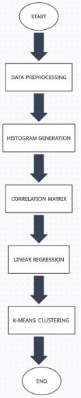
Figure 1. Flowchart of Statistical Analysis.
2.2. Data Preprocessing
1. Student grade data was extracted from an Excel sheet containing subject-wise marks, semester-wise SGPA, and cumulative CGPA.
2. Letter grades (A+, A, B, etc.) were mapped to numerical values using a predefined scale.
3. Missing values and empty columns were removed to ensure data consistency.
3. Results
3.1. Histograms for All Subjects
The process of generating histograms for each subject's grades involved several steps. Initially, the dataset containing student registration numbers and their respective grades across various subjects was imported. The grades, originally in alphabetic format, were converted to numeric values to facilitate analysis.
Histograms were created for each subject to visualize the distribution of grades. The following steps outline the histogram generation process:
1. Mapping Subject Codes to Names: A dictionary was established to map subject codes to their respective names for better readability in the plots.
2. Selection of Columns: Specific columns representing different subjects were selected for plotting.
3. Grade Distribution: For each subject, the grade distribution was calculated by counting the occurrences of each grade.
4. Sorting Values: The grades were sorted in ascending order to ensure logical progression in the histograms.
5. Plotting Histograms: Using matplotlib and seaborn, histograms were plotted for each subject, displaying the count of students for each grade.
(A) Database Management Systems Lab
Description: The histogram in Figure 2 represents the distribution of grades achieved by students in the Database Management Systems Lab. There are two bars in the histogram. The first bar, representing grade 9, shows that 25 students achieved this grade. The second bar, representing grade 10, indicates that a significantly higher number of students, 90, received this grade.
The histogram reveals a noticeable skew towards higher grades, with a large majority of students scoring a perfect 10. The relatively lower count of students scoring a grade of 9 suggests a high level of proficiency among students in this lab course. The ratio of grade 10: grade 9 = 90/25 = 3.6, indicating that students are more likely to receive 10 points rather than 9. The absence of lower grades is a clear indication of the high-scoring nature of this lab course.
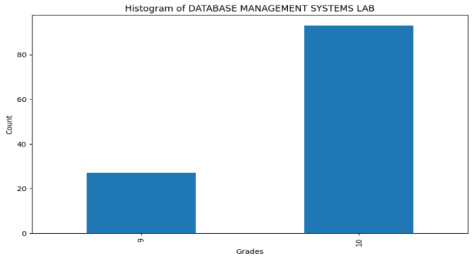
Figure 2. Histogram of Database Management Systems Lab.
(B) Fundamentals of Artificial Intelligence
Description: The histogram represents the distribution of grades achieved by students in the Fundamentals of Artificial Intelligence course.
The histogram in Figure 3 shows a peak at grade 8, indicating that the majority of students scored around this grade. A significant number of students also scored grades 7 and 9, creating a relatively normal distribution with a slight skew towards lower grades. Very few students scored the highest grade (10) or the lowest grade (6).
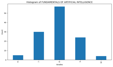
Figure 3. Histogram of Fundamentals of Artificial Intelligence.
(C) Database Management Systems
Description: The histogram represents the distribution of grades achieved by students in the Database Management Systems course. The x-axis ranges from 5 to 10. The y-axis ranges from 0 to 50.
The histogram reveals a noticeable skew towards higher grades, with a large majority of students scoring a perfect 10. The relatively lower count of students scoring a grade of 9 suggests a high level of proficiency among students in this lab course. The ratio of grade 10: grade 9 = 90/25 = 3.6, indicating that students are more likely to receive 10 points rather than 9. The absence of lower grades is a clear indication of the high-scoring nature of this lab course. As far as high scoring grades are concerned, DBMS theory and lab are in complete opposition. Compared to the lab, in the theory portion of the course, students are likely to receive a grade of 10 only about 0.15 times the grade of 9. This contrasts sharply with the high ratio of 3.6 for the lab. Additionally, the chances of getting 8 grade points in the DBMS theory course are the highest, making it an 8-averaged class for this course. The histogram reveals a right-skewed distribution, with the highest frequency at grade 9, followed by grade 8. The significant number of students scoring grades 8 and 9 indicates a strong understanding of the subject. The relatively lower counts of students scoring grades 5 and 6 suggest that most students have a solid grasp of the course material.
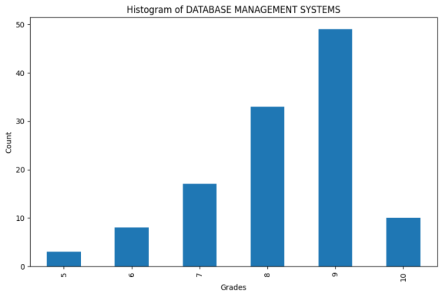
Figure 4. Histogram of Database Management Systems.
(D) ARTS
Description: The histogram in Figure 6 represents the distribution of grades achieved by students in the ARTS subject. The grades range from 6 to 10.
The histogram reveals a noticeable skew towards higher grades, with the majority of students scoring a perfect 10. There is a notable drop in the number of students receiving lower grades, indicating that most students performed exceptionally well in the ARTS subject. The nature of the arts histogram is peculiar in the sense that it is a progressively rising histogram. In this course, it is a perfect progressive rise since the previous histogram value is always lower and the next value is always higher than the current histogram value. This can be represented as hp<hc<hn. Perfect progressive histograms are rare and can be expressed as ex. For the arts course, it seems to follow ex.
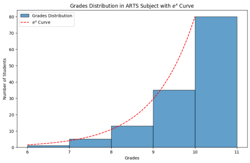
Figure 5. Exp Fit to ARTS grades.
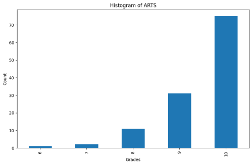
Figure 6. Histogram of Arts.
(E) Discrete Mathematics
Description: The histogram in Figure 7 represents the distribution of grades achieved by students in the Discrete Mathematics course. The grades range from 6 to 10.
The histogram reveals a distribution with the highest frequency at grade 9, followed by grade 10. A significant number of students scoring grades 8, 9, and 10 indicates a strong understanding of the subject. The relatively lower counts of students scoring grades 6 and 7 suggest that most students have a solid grasp of the course material. The graph is right-skewed, with a 10: 9 ratio of 0.7, indicating that students are less likely to receive a grade of 10 compared to a grade of 9.
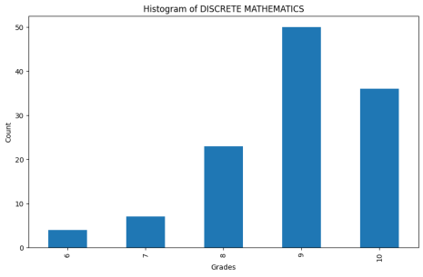
Figure 7. Histogram of Discrete Mathematics.
(F) Object-Oriented Programming Through Java Lab
Description: The histogram in Figure 8 represents the distribution of grades achieved by students in the Object-Oriented Programming Through Java Lab course. The grades include values 8, 9, and 10.
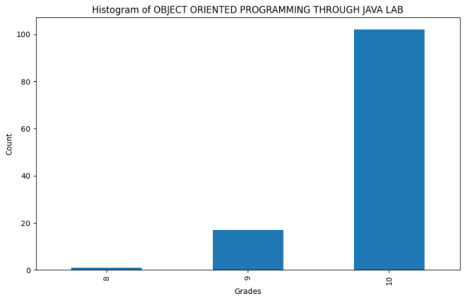
Figure 8. Histogram of OOPJ Lab.
The histogram reveals a noticeable skew towards higher grades, with the majority of students scoring a perfect 10. A smaller number of students received a grade of 9, and very few students received a grade of 8. This distribution indicates that most students achieved the highest grade, suggesting strong proficiency in the practical implementation of object-oriented programming concepts in Java. The nature of this histogram is similar to that of the DBMS lab, indicating that both labs follow similar instructional and methodological approaches. The strong performance in both OOPS Java and DBMS labs also indicates a straightforward question-answer approach to the labs, as well as the coding nature of these labs. Students seem to value these labs highly and consider them essential for their future projects and career growth.
(G) Operating Systems
Description: The histogram in Figure 9 represents the distribution of grades achieved by students in the Operating Systems course. The grades range from 6 to 10.
The histogram reveals the highest frequency of students scoring grade 9, followed by grades 8 and 10. A significant number of students scoring grades 8, 9, and 10 indicates a strong understanding of the subject. The lower counts of students scoring grades 6 and 7 suggest that most students have a solid grasp of the course material. The histogram rises sharply to the peak at grade 9 and then falls, indicating a sharp decline around the peak grade. The flat peak and right-skewed nature of the histogram indicate equality in achieving higher-side grades and tend to distribute the class evenly in terms of high grades.
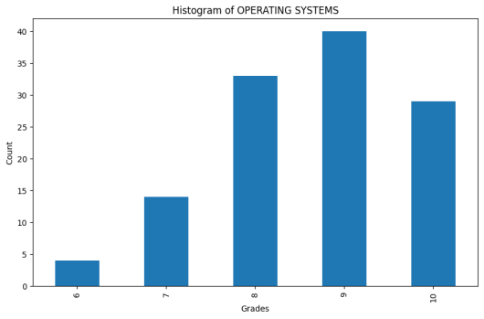
Figure 9. Histogram of Operating Systems.
(H) Object-Oriented Programming Through Java
Description: The histogram in Figure 10 represents the distribution of grades achieved by students in the Object-Oriented Programming Through Java course. The grades range from 5 to 10.
The histogram shows the highest frequency of students scoring grades 8 and 9, followed by grade 7. A significant number of students scoring grades 8 and 9 indicates a strong understanding of the subject. The relatively lower counts of students scoring grades 5 and 6 suggest that most students have a solid grasp of the course material.
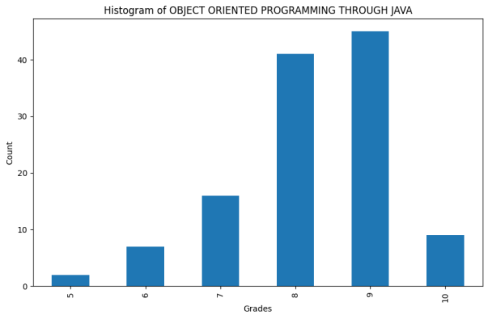
Figure 10. Histogram of OOPJ.
(I) Operating Systems & Linux Programming Lab
Description: The histogram in Figure 11 represents the distribution of grades achieved by students in the Operating Systems & Linux Programming Lab course. The grades range from 9 to 10.
The histogram shows a significant skew towards higher grades, with the majority of students receiving a grade of 10. A smaller number of students received a grade of 9. This distribution indicates that most students achieved the highest grade, suggesting strong proficiency in the practical implementation of operating systems and Linux programming concepts. The histogram is similar to those of the DBMS lab and the OOP Java lab, indicating that all three labs follow similar instructional and methodological approaches. The 10: 9 grade ratio is 5, similar to that of the OOP Java lab, whereas it was 3.6 in the DBMS lab. These high positive ratios increase the chance of receiving a grade of 10 for students who perform relatively well in the lab.
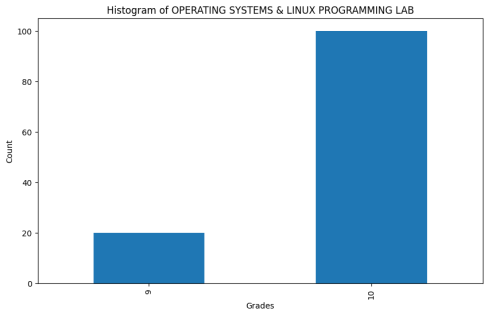
Figure 11. Histogram of OS & Linux Lab.
(J) Indian Constitution
Description: The histogram in Figure 12 represents the distribution of grades achieved by students in the Indian Constitution course. The histogram shows a single bar reaching up to a count of 120. This histogram indicates that all the grades fall within a single bin, suggesting no variation in the grades.
The histogram reveals a highly uniform distribution, with every student receiving the same grade. This uniform distribution implies that either the assessment was exceptionally well-tailored to the students' abilities, or there might have been a grading policy or system that led to all students receiving the same grade. The instructor has clearly followed the strategy of grouping the students into only two broad categories – "Satisfactory" and "Non-Satisfactory" – and has decided that all the students in the class performed uniformly "Satisfactory." The absence of variation in grades suggests a possible lack of differentiation in student performance or a standardized grading system that does not account for individual differences in understanding and performance.
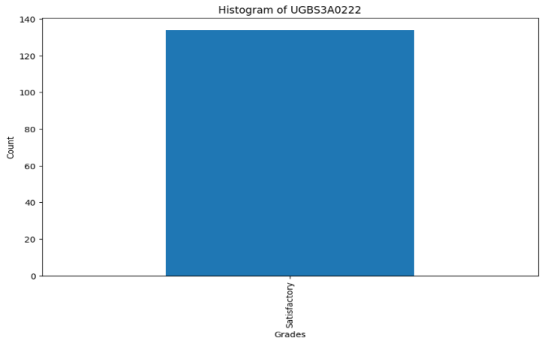
Figure 12. Histogram of Indian Constitution.
3.2. Linear Regression and Scatter Plot
To analyze the relationship between SGPA (Semester Grade Point Average) and CGPA (Cumulative Grade Point Average), a linear regression analysis was performed. First step is Data Preparation. The dataset was cleaned by dropping rows with NaN values in the SGPA or CGPA columns to ensure a robust analysis. The linregress function from the scipy library was used to perform linear regression on SGPA and CGPA. The slope, intercept, R-squared value, p-value, and standard error were computed. A scatter plot was created to visualize the relationship between SGPA and CGPA. The data points were plotted, and a linear fit line was added to highlight the trend.
Results: The results indicated the strength and direction of the linear relationship between SGPA and CGPA. The scatter plot, enhanced with the linear regression line, provided a clear visual representation of this relationship, aiding in the understanding of how semester performance influences cumulative performance. The closeness of the y-intercept to the origin, coupled with the near-unity slope value for the linear fit, indicates a strong one-to-one correlation between CGPA and SGPA.
Linear Equation:
CGPA =0.94 × SGPA+0.46
R-squared Value:
R2 = 0.7921
The high R-squared value of 0.7921 indicates a strong positive correlation between SGPA and CGPA, meaning that higher semester grades are likely to result in higher cumulative grades.
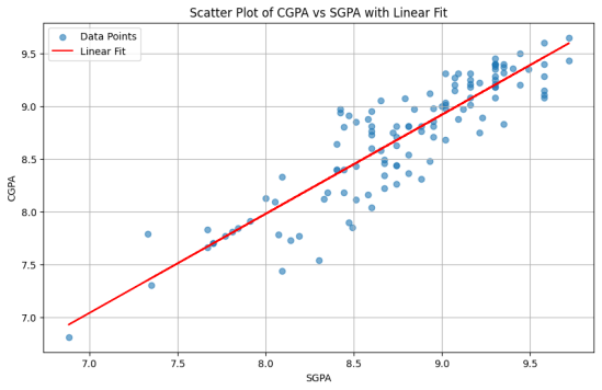
Figure 13. Scatter Plot of CGPA vs SGPA with Linear Fit.
SGPA & CGPA Clustering as Holistic Performance Indicators:
The clustering of SGPA and CGPA serves as a holistic indicator of student performance trends, helping educators identify students who require additional academic support and those who consistently excel. By understanding these relationships, educators can better tailor their teaching methods and interventions to support student learning across different subjects.
3.3. Correlation Matrix
To understand the relationships between various subjects, a correlation matrix was computed. A dictionary was created to map subject codes to their respective names for better readability in the matrix. Specific columns representing different subjects were selected for analysis. The correlation matrix was calculated using the corr method, which computes the Pearson correlation coefficients between pairs of subjects. The correlation values were rounded to three decimal places, and any missing values were filled with zeros. The indices and column names of the correlation matrix were renamed to their respective subject names for clarity. The correlation matrix was visualized as a heatmap using seaborn. The heatmap displayed the correlation values with a color gradient, where blue indicated lower correlation and red indicated higher correlation.
DBMS LAB & Fundamentals of AI: A moderate positive correlation of 0.59 indicates that students who perform well in DBMS Lab also tend to perform well in AI fundamentals.
DBMS & Operating Systems: A positive correlation suggests that proficiency in DBMS is associated with a good understanding of Operating Systems.
ARTS & Indian Constitution: A low or no correlation indicates that performance in ARTS is independent of performance in the Indian Constitution.
Positive Correlations: Subjects like DBMS LAB and Fundamentals of AI, as well as DBMS and Operating Systems, show positive correlations, indicating that students' performances in these subjects are related. This suggests that skills and knowledge in one subject can positively influence performance in another related subject.
Negative or No Correlations: Subjects such as ARTS and Indian Constitution show low or no correlation, indicating that performance in these subjects is independent of each other. This can imply that these subjects require different skill sets and areas of knowledge.
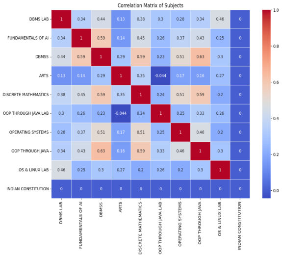
Figure 14. Correlation Matrix of subjects
4. Conclusion
The integration of theoretical insights and practical application of regression and correlation provides a comprehensive understanding of student performance distribution. This approach aids educators in identifying patterns, understanding performance distribution, and implementing targeted interventions. Since the subjects are common in CS syllabi throughout the nation, the study serves as a datum for other institutes as well. The linearity of SGPA and CGPA serves as a holistic indicator of student performance trends. Based upon the correlation trend, educators can identify students who require additional academic support in a course.
Abbreviations

SGPA

Semester Grade Point Average

CGPA

Cumulative Grade Point Average

DBMS

FAI

Data Base Management Systems

Fundamentals of Artificial Intelligence

DM

Discrete Mathematics

OOP

Object Oriented Programming

OOPJ

Object Oriented Programming Through Java

OS

Operating Systems

Conflicts of Interest
The authors declare no conflicts of interest.
References
[1] MacQueen, J. (1967). Some methods for classification and analysis of multivariate observations. Proc. Fifth Berkeley Symposium on Mathematical Statistics and Probability, Volume 1: Statistics, University of California Press, Berkeley, 281-297.
[2] Pedregosa et al. (2011). Scikit-learn: Machine learning in Python. Journal of Machine Learning Research, vol. 12, 2825-2830.
[3] Imani, E., Luedemann, K., Scholnick-Hughes, S., Elelimy, E., & White, M. (2024). Investigating the Histogram Loss in Regression.
[4] Minami, M., Lennert-Cody, C. E. Regression Tree and Clustering for Distributions. J. Agri. Bio. Env. Stats. (2024).
[5] Zhang et al (2023). Improving the Accuracy and Internal Consistency of Regression-Based Clustering of High-Dimensional Datasets. Stat Appl Genet Mol Biol. 2023 Jul 25; 22(1).
[6] Park, C., Choi, H., Delcher, C., Wang, Y., Yoon, Y. (2019). Convex Clustering Analysis for Histogram-Valued Data. Biometrics, 75(2), 603-612.
[7] Benzel, S., & Stanescu, A. (2020). Histogram Methods for Unsupervised Clustering. Proceedings of the 2020 ACM Southeast Conference, Pages 248 - 251.
[8] Hang, H., Huang, T., Cai, Y., Yang, H., & Lin, Z. (2021). Gradient Boosted Binary Histogram Ensemble for Large-scale Regression.
[9] List, F. (2021). The Earth Mover's Pinball Loss: Quantiles for Histogram-Valued Regression. Proc. Machine Learning Res., Vol. 139, 6713-6735.
[10] Hang et al (2021). Histogram Transform Ensembles for Large-scale Regression. J. Machine Learning Res., vol. 22, 1-87.
[11] Hu, J., Chen, Y., Leng, C., & Tang, C. Y. (2023). Applied Regression Analysis of Correlations for Correlated Data. arXiv preprint arXiv: 2109.05861v2.
Cite This Article
  • APA Style

    Atukuri, S. S., Busam, S., Khushalani, B. (2025). Exploring Academic Trends with Histograms, Linear Regression, and Correlation Matrix. American Journal of Education and Information Technology, 9(1), 57-68. https://doi.org/10.11648/j.ajeit.20250901.18

    Copy | Download

    ACS Style

    Atukuri, S. S.; Busam, S.; Khushalani, B. Exploring Academic Trends with Histograms, Linear Regression, and Correlation Matrix. Am. J. Educ. Inf. Technol. 2025, 9(1), 57-68. doi: 10.11648/j.ajeit.20250901.18

    Copy | Download

    AMA Style

    Atukuri SS, Busam S, Khushalani B. Exploring Academic Trends with Histograms, Linear Regression, and Correlation Matrix. Am J Educ Inf Technol. 2025;9(1):57-68. doi: 10.11648/j.ajeit.20250901.18

    Copy | Download

  • @article{10.11648/j.ajeit.20250901.18,
      author = {Satya Sri Atukuri and Sruthi Busam and Bharat Khushalani},
      title = {Exploring Academic Trends with Histograms, Linear Regression, and Correlation Matrix
    },
      journal = {American Journal of Education and Information Technology},
      volume = {9},
      number = {1},
      pages = {57-68},
      doi = {10.11648/j.ajeit.20250901.18},
      url = {https://doi.org/10.11648/j.ajeit.20250901.18},
      eprint = {https://article.sciencepublishinggroup.com/pdf/10.11648.j.ajeit.20250901.18},
      abstract = {In recent years, the field of education has seen a growing interest in the use of data mining techniques to improve teaching, learning, and administrative decision-making. Data mining refers to the process of uncovering hidden patterns, correlations, and useful information from large volumes of data. It involves applying various computational and statistical methods to analyze datasets that are often too complex or vast for traditional aanalysis methods. In the context of education, it can be used to analyze student performance, predict academic success, identify at-risk students, personalize learning paths, and improve curriculum design. By using classification algorithms, educational institutions can categorize student data and outcomes. This allows educators to develop targeted interventions and support systems that address individual student needs. Clustering techniques can group students by performance or engagement levels, offering insights into effective teaching strategies for different learner groups. Histograms, regression and correlative analysis can reveal broader trends, such as the impact of teaching methods or the effectiveness of online learning tools. These insights help institutions make data-driven decisions that enhance the overall educational experience. The present study analyzes a dataset of student registration numbers and their respective grades across all subjects. Alphabetic grades were converted to numeric values to facilitate analysis. Histograms of all subjects' grades were generated, followed by linear regression and a correlation matrix to identify relationships between subjects. The outputs include scatter plots for linear regression results and a correlation matrix for subject relationships.
    },
     year = {2025}
    }
    

    Copy | Download

  • TY  - JOUR
    T1  - Exploring Academic Trends with Histograms, Linear Regression, and Correlation Matrix
    
    AU  - Satya Sri Atukuri
    AU  - Sruthi Busam
    AU  - Bharat Khushalani
    Y1  - 2025/06/16
    PY  - 2025
    N1  - https://doi.org/10.11648/j.ajeit.20250901.18
    DO  - 10.11648/j.ajeit.20250901.18
    T2  - American Journal of Education and Information Technology
    JF  - American Journal of Education and Information Technology
    JO  - American Journal of Education and Information Technology
    SP  - 57
    EP  - 68
    PB  - Science Publishing Group
    SN  - 2994-712X
    UR  - https://doi.org/10.11648/j.ajeit.20250901.18
    AB  - In recent years, the field of education has seen a growing interest in the use of data mining techniques to improve teaching, learning, and administrative decision-making. Data mining refers to the process of uncovering hidden patterns, correlations, and useful information from large volumes of data. It involves applying various computational and statistical methods to analyze datasets that are often too complex or vast for traditional aanalysis methods. In the context of education, it can be used to analyze student performance, predict academic success, identify at-risk students, personalize learning paths, and improve curriculum design. By using classification algorithms, educational institutions can categorize student data and outcomes. This allows educators to develop targeted interventions and support systems that address individual student needs. Clustering techniques can group students by performance or engagement levels, offering insights into effective teaching strategies for different learner groups. Histograms, regression and correlative analysis can reveal broader trends, such as the impact of teaching methods or the effectiveness of online learning tools. These insights help institutions make data-driven decisions that enhance the overall educational experience. The present study analyzes a dataset of student registration numbers and their respective grades across all subjects. Alphabetic grades were converted to numeric values to facilitate analysis. Histograms of all subjects' grades were generated, followed by linear regression and a correlation matrix to identify relationships between subjects. The outputs include scatter plots for linear regression results and a correlation matrix for subject relationships.
    
    VL  - 9
    IS  - 1
    ER  - 

    Copy | Download

Author Information
  • Department of Artificial Intelligence, Shri Vishnu Engineering College for Women, Bhimavaram, India

  • Department of Artificial Intelligence, Shri Vishnu Engineering College for Women, Bhimavaram, India

  • Department of Artificial Intelligence, Shri Vishnu Engineering College for Women, Bhimavaram, India